BQF
Project
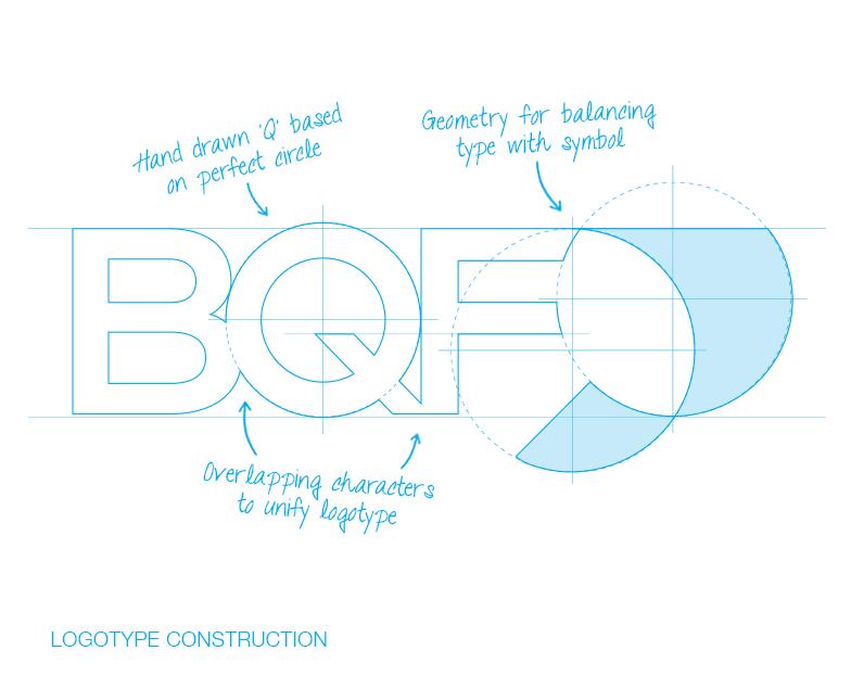
When the British Quality Foundation shortened their name to BQF, they needed to evolve their visual identity accordingly. Yellowdot used the existing ‘flourish’ device, refined and then integrated it into a new letterform setting. Great care was taken in re-drawing this to ensure the optimal balance of components, and the new logo was then rolled-out across a wide range of assorted collateral – ranging from stationery and marketing material, to award certificates and ultimately new large format interior graphics following an office move.


