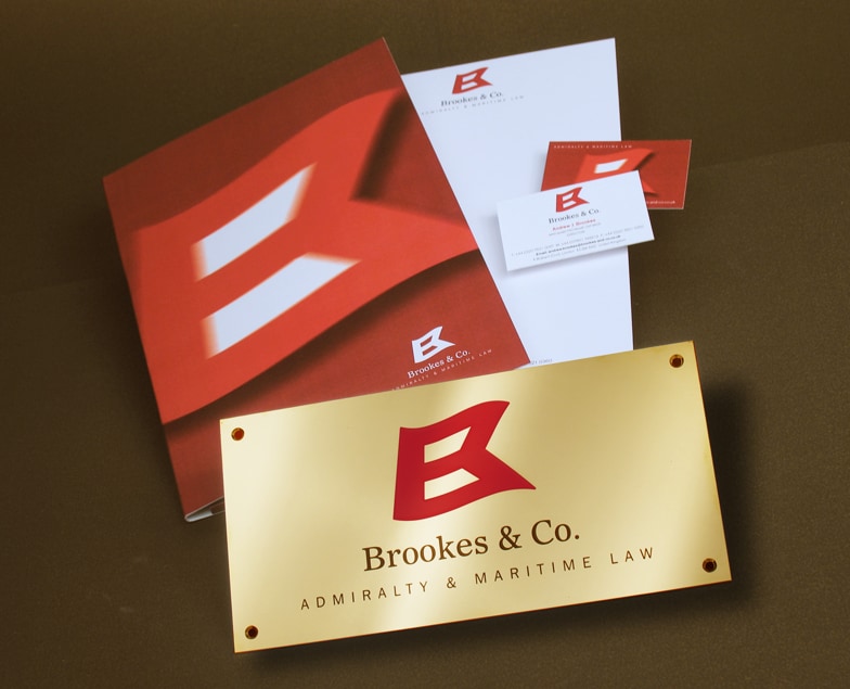
Brookes and Co.
Project
Briefed to evolve an existing logo for this company of maritime solicitors, we created this powerful and dynamic symbol. Inspired by the nautical flag for the letter ‘B’, the new identity has been applied across the full range of business collateral.
“It’s always a thrill to brief Jeremy and his team on a new project, and it’s great fun to see what they come up with. We had an existing logo, which had also been designed by Yellowdot, but we felt it was time to update our image: we wanted to inject more energy and vigour. Jeremy knew exactly what we wanted and produced various examples for us to review, but we fell head over heels for the flag which perfectly matches our business as maritime solicitors. The fact that it bears some resemblance to the maritime signal flag for discharging or carrying dangerous goods probably says it all. Our thanks to Jeremy and his team at Yellowdot for their boundless enthusiasm and for coming up with this entirely original idea (and we’re looking forward to the next project).”
Brookes & Co.


